Design successful Campaign Pages: our ultimate guide
Our free, powerful and practical technology provides you with the tools you need for creating outstanding campaign pages that carry the right message and compel your visitors to donate.
Before you get started
Video Overview
Walkthrough
Before you get started
Video Overview
Walkthrough
Before you get started
Video Overview
Walkthrough
Before You Get Started
- Have you set up a Core Profile? It's a critical first step.
For personalized help, join our weekly Community Office Hours.
Video Overview
Walkthrough
In this guide, we walk you through the design elements and best practices for crafting a visually appealing Campaign Page. We also provide examples of successful campaign pages to get you inspired.
Throughout the process, remember to tell a story. When people see your Campaign Page, they should be reminded of your organization’s mission and impact. We recommend completing all the elements of your Campaign Page directly in the Nonprofit Admin Portal for best results.
You can download a printable PDF version of this design guide here.
Engender trust with branding
To engender trust in visitors to your donation page, make sure the page’s look is aligned with that of your brand so that supporters know right away that your page is legitimate.
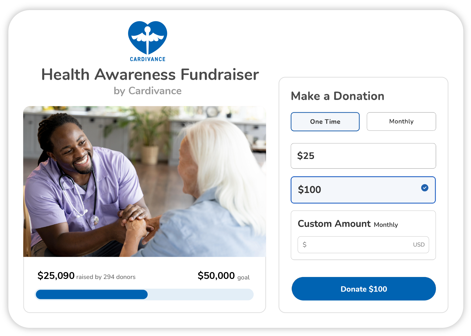
Logo
The first thing visitors see on your page is your logo. Upload a high-quality version of your logo, one that is easy to read and looks good on multiple devices. Your logo image should be:
- minimum of 640x640 pixels
- no larger than 1MB
- in JPG format
Brand color
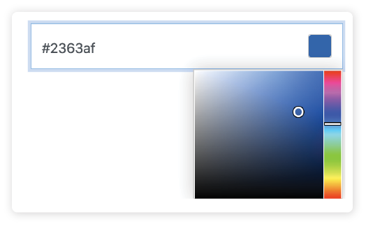
Most nonprofits identify one color to represent their brand in external communications. Feature that color on your page. (Note that, to ensure the strong color contrasts conformant with accessibility standards, your brand color is used only on some buttons, default images, icons and other small color highlights.) To do this, insert your hexadecimal (also called hex) color code, which consists of a six-digit alphanumeric code (for example: #2363AF).
If you don’t have access to this code, ask your nonprofit’s designer or brand manager. Alternatively, try this free online tool to identify the hex code yourself by uploading an image that features your brand color prominently.
Include compelling imagery
Campaign Pages are well suited to organizations wishing to feature a logo and mission statement, as well as video and impact stories, all to motivate your visitors at a glance. It is also ideal for virtual events that involve an important pre-recorded or livestreamed video component.
Primary Image
Your primary image is a very prominent part of your page. Upload a high-quality image that genuinely shows what your nonprofit does. Your primary image should be:
- recommended size of 2000x1200 pixels (it will be cropped to a 5:3 aspect ratio if it isn't already)
- in JPG, JPEG or PNG format.
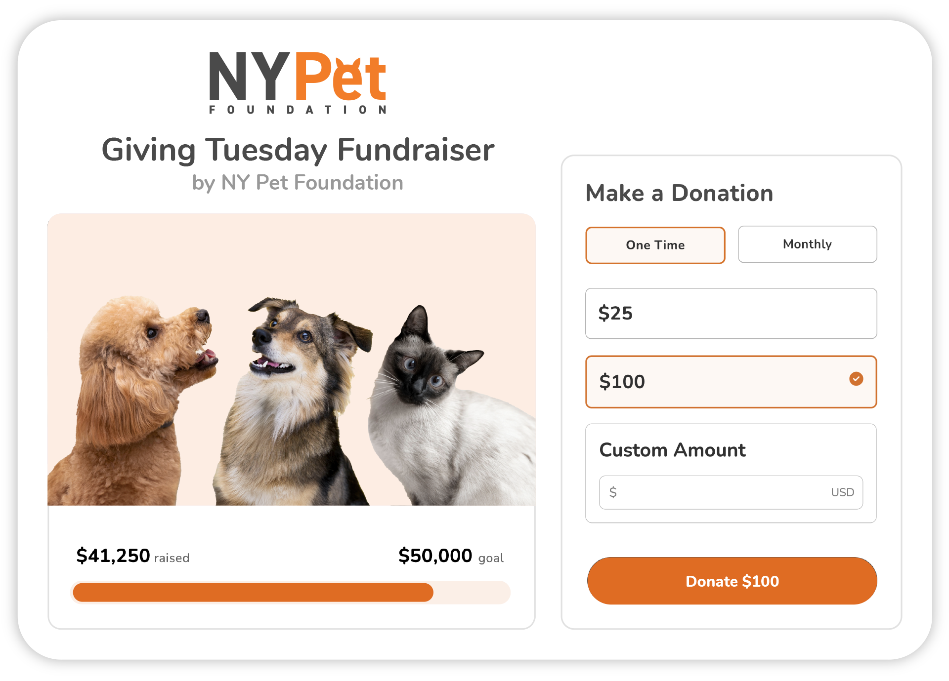
Video
There are two places to embed video (only Vimeo and YouTube [but not YouTube Shorts]): (1) in the prominent position at the top of the page and (2) within the body of the page. Whether part of a virtual fundraiser or not, added video should tell more of your story and include a clear call to action, driving people to donate. (Click here for instructions about adding a video.) Remember to select a visually appealing video thumbnail that aligns with the look of your page.
Resources
Here’s a trio of free or affordable online resources that provide access to high-quality images and graphics that will make your campaign pages stand out from the crowd.
- Create graphics online for free: www.canva.com.
- Free, professional, royalty-free images: www.unsplash.com.
- Affordable digital assets: www.elements.envato.com.
Write a clear mission statement
People get excited to donate to your nonprofit organization based on its impact. In your Core Profile, tell them why your organization exists, who benefits from your efforts and how. Keep it short and to the point for maximum effect.
On your Campaign Pages, keep it more focused on the campaign itself. Learn more about how to optimize a campaign page description (scroll down to the appropriate section).
On both Core Profiles and Campaign Pages, you can add images, links to other pages and format the text as you like, but we recommend keeping it simple so that the focus remains on getting donations. For best results when adding your mission statement, we recommend typing and formatting it directly in the text-editing window, not copy-pasting it from another document. Text copied from other word processing software sometimes includes unseen code that interferes with our text-editing tool. If you already have a prepared text, copy-paste it into a text (.txt) file to strip it of unseen code and then recopy-paste it into the text-editing window, where you can reformat it.

Resources
- Nonprofit Mission Statements – Good and Bad Examples
- 5 Favorite Nonprofit Mission Statements – and what you can learn from them
Add powerful impact stories
When supporters are passionate about a cause and are clear about the impact of each donated dollar, they feel more compelled to give. The Impact Stories section of your Campaign Page is a great way to creatively showcase the strength of your work.
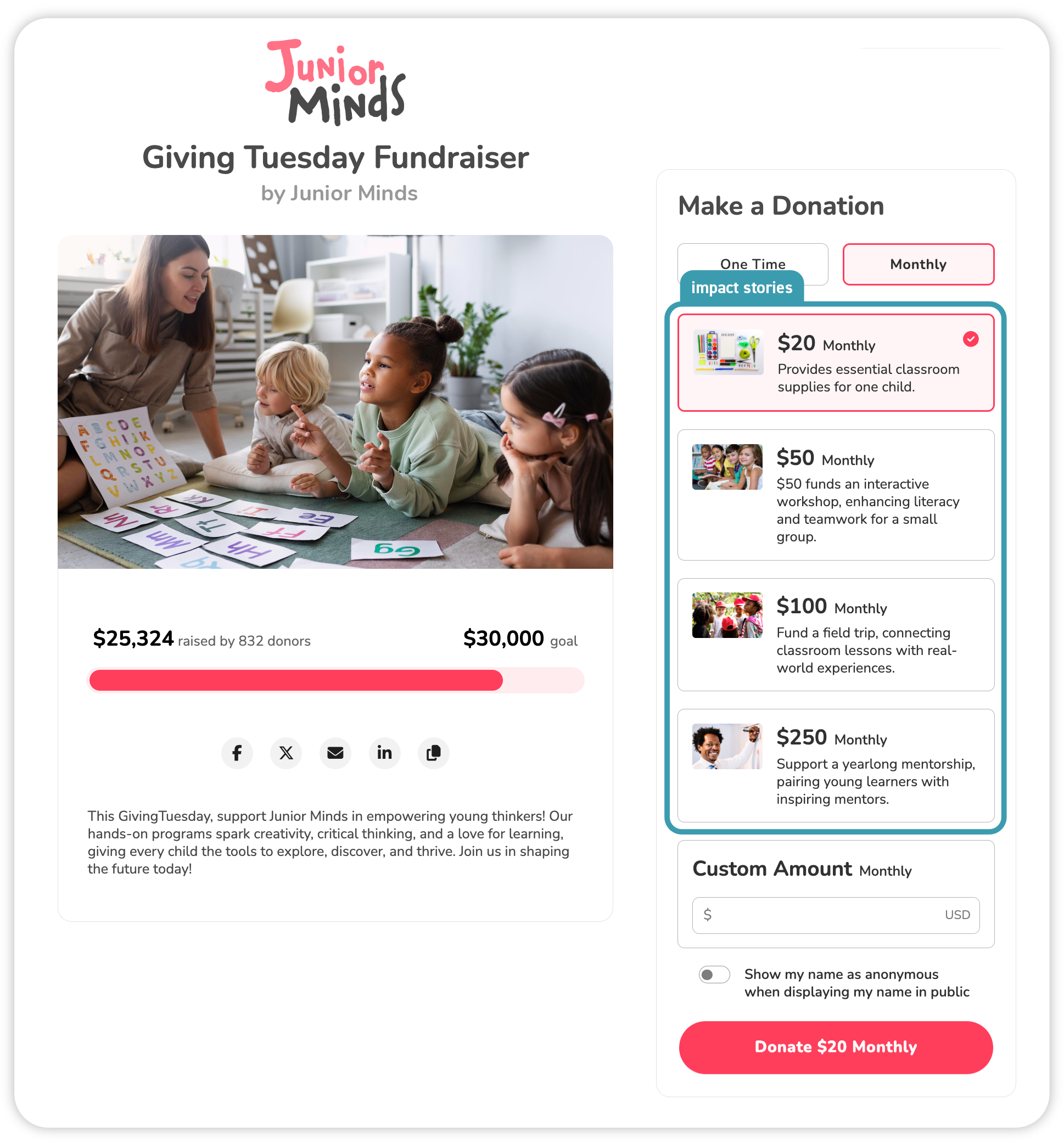
Donation amounts
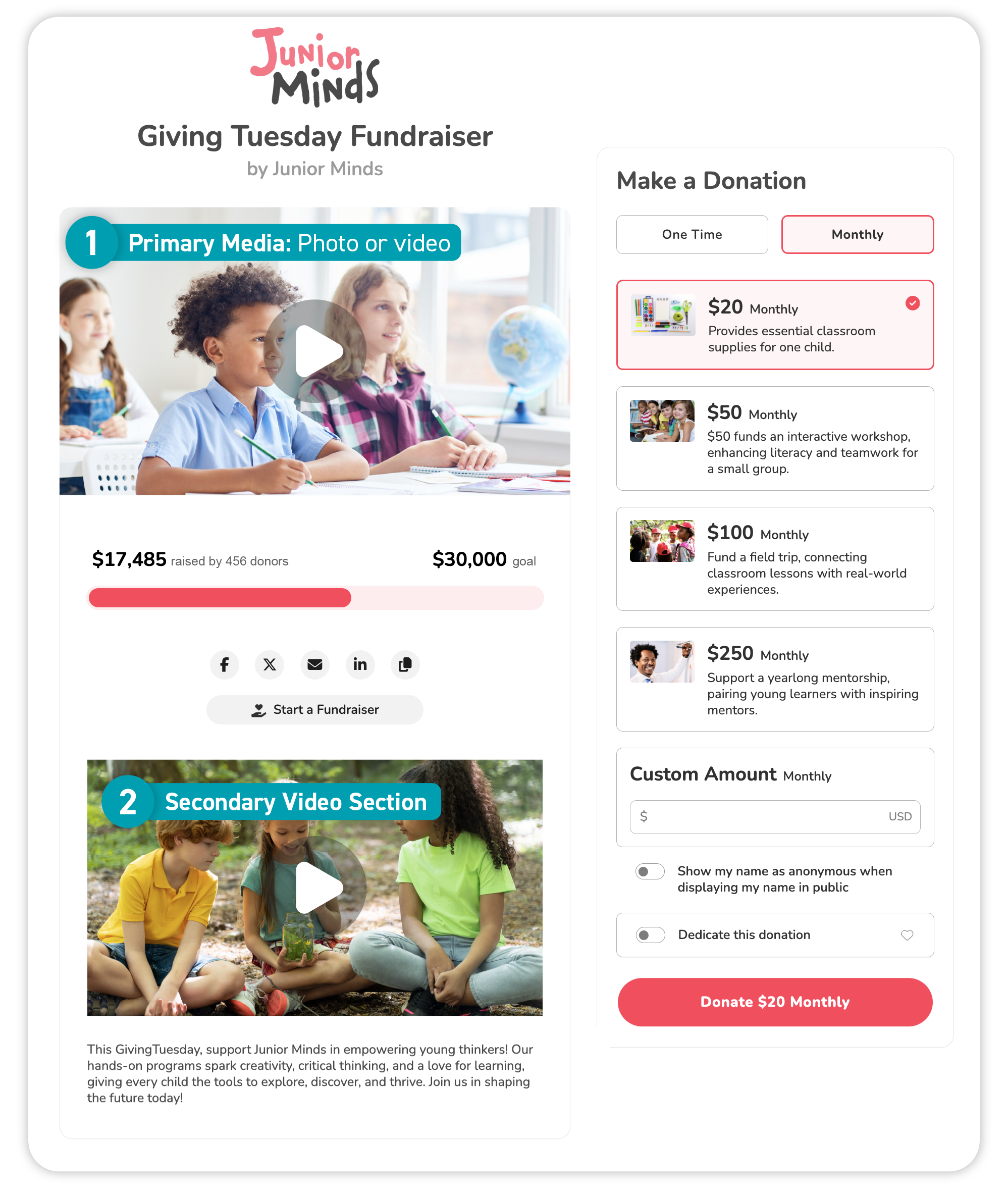
Select donation amounts closely associated with your nonprofit stories (see above, for examples) or that otherwise make sense for your organization.
Impact stories
Inspire donors with compelling impact stories. Use active, powerful verbs and keep it concise. Include practical and verifiable examples of where the donated money goes, or get creative and use numbers that relate to your impact.
Impact stories images
Select images for your impact stories that illustrate your mission and add personality to your page. Make sure your images are relevant visual supports for the impact stories. For example, pick images that spotlight the communities your organization supports or materials your nonprofit provides (such as books, school supplies etc.). Get inspired by the examples shown here to craft your own impact stories. Make sure your images are relevant visual supports for the impact stories. The ideal image size is 1200x700 pixels, but should be no smaller than 600x390 pixels. It should also be no larger than 1MB and in JPG format.
Consider these additional resources
Give Lively resources
- See our tech in action (live Give Lively example pages for inspiration)
- Build a Campaign Page
- Set up notifications for every donation
External resources
- 94 Free or Low-Cost Online Tools and Resources for Nonprofits
- Free online tool to identify your HEX color
- Create graphics online for free
- Free, professional, royalty-free images
- Affordable digital assets (photos, videos, graphics, audio, and templates)
- Nonprofit Mission Statements – Good and Bad Examples
- 5 Favorite Nonprofit Mission Statements – and what you can learn from them


